
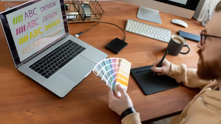
The resume font size and style you use to write your resume make a big difference. As employers have so many resumes to look through, they scan them in seconds.
First impressions are all important. If there’s something they don’t like about a resume, such as an inappropriate or difficult-to-read font, it will be dismissed.
Keep reading to find out what the best resume fonts are for 2026 and how you can use our AI resume builder to make sure you have the perfect format.
Which Fonts are Best for Resumes? (Fonts by Industry)
The best fonts to use for resumes are clear and simple. Not only to make it easy-to-read for prospective employers, but also for ATS (Applicant Tracking Systems).
However, keep in mind that depending on your industry, some fonts may be better than others. Review the following table to see which resume font works best for the role you want.
| Best resume font | Target industry | Why it works |
|---|---|---|
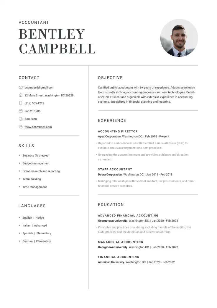
| Calibri, Helvetica, Garamond, Cambria | Corporate & business (Finance, Legal, HR, Ops) | Conveys high credibility, structure, and traditional corporate professionalism. |
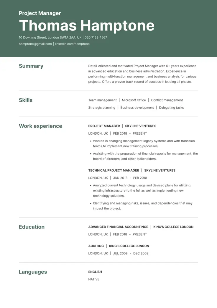
| Helvetica, Roboto, Lato | Tech & startups (Software, IT, Product, Data) | Sleek, geometric, and minimalist; projects innovation and a modern feel. |
| Lato, Roboto, Garamond, Trebuchet MS | Creative fields (Design, Marketing, Media) | Offers a touch of personality and design-forward flair without hurting readability. |
| Georgia, Cambria, Merriweather | Academia & science (Education, Research, R&D) | Authoritative and scholarly; mirrors the look of published academic journals. |
| Calibri, Merriweather, PT Sans | Nonprofit & Public Sector | Highly legible and open; communicates approachability and trustworthiness. |
Best Font Size for a Resume
As a good tip, don’t shrink your font size just to squeeze in extra words. Make sure that employers don’t have to squint to read your resume.
At the same time, space is precious for creating an effective resume format, and excessively large text makes it look like you lack information.
Landing the perfect balance keeps your formatting professional and your layout restricted to an ideal 1-2 pages.
For maximum readability, follow these standard size guidelines:
- Main body text: 11 pt (no larger than 12 pt)
- Section subheadings: 14 pt
- Main header (Your name): 22–24 pt
Other Resume Typography and Design Tips
To make sure your resume looks professional and remains easy on the eye, keep these important design principles in mind:
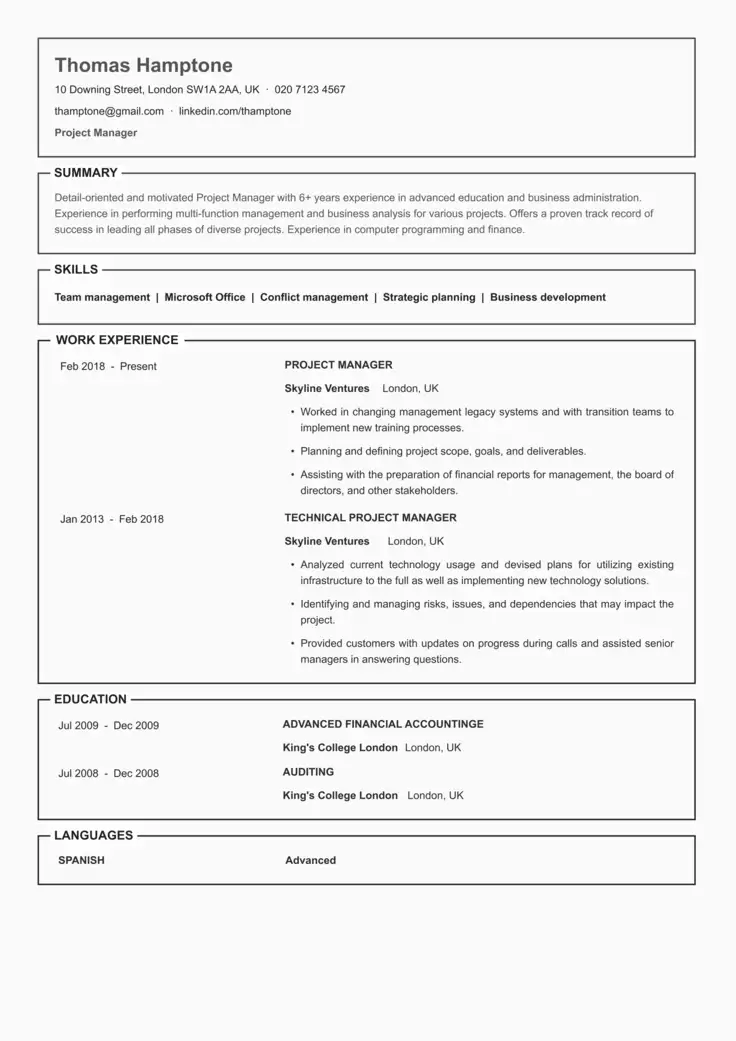
- Break up dense text: Use headings and bullet points to avoid wordy paragraphs that overwhelm recruiters.
- Keep the format consistent: Make sure font sizes and margins are kept consistent to avoid a sloppy-looking resume.
- Use color strategically: Use a simple color scheme sparingly to highlight important sections.
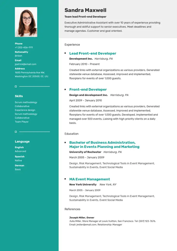
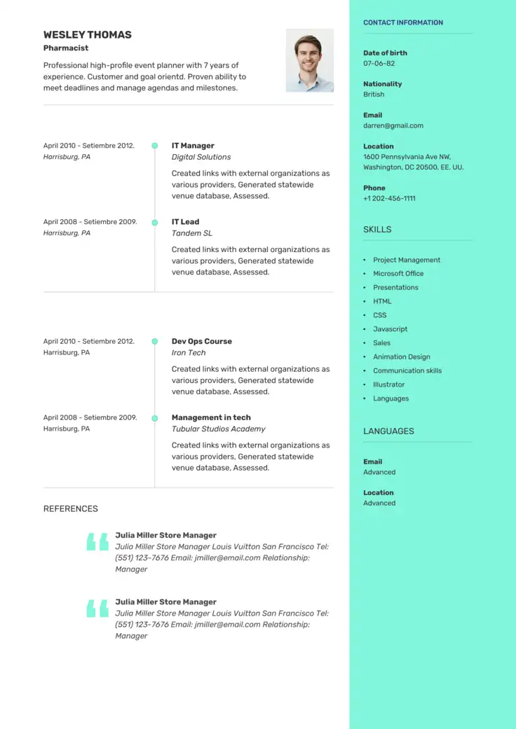
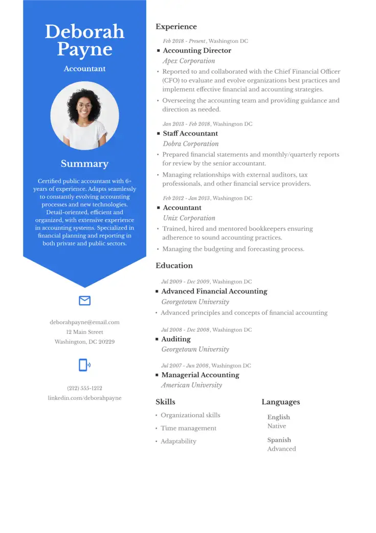
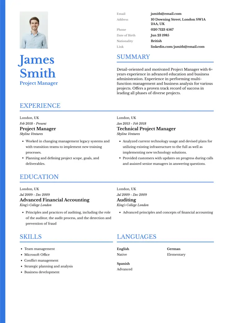
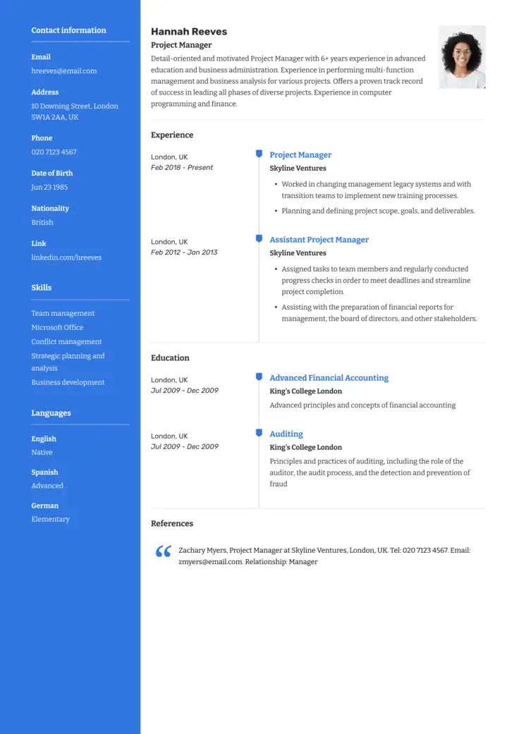
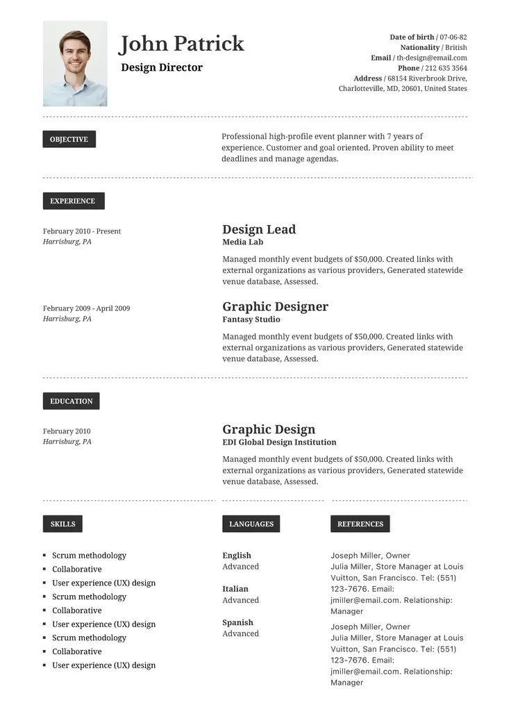
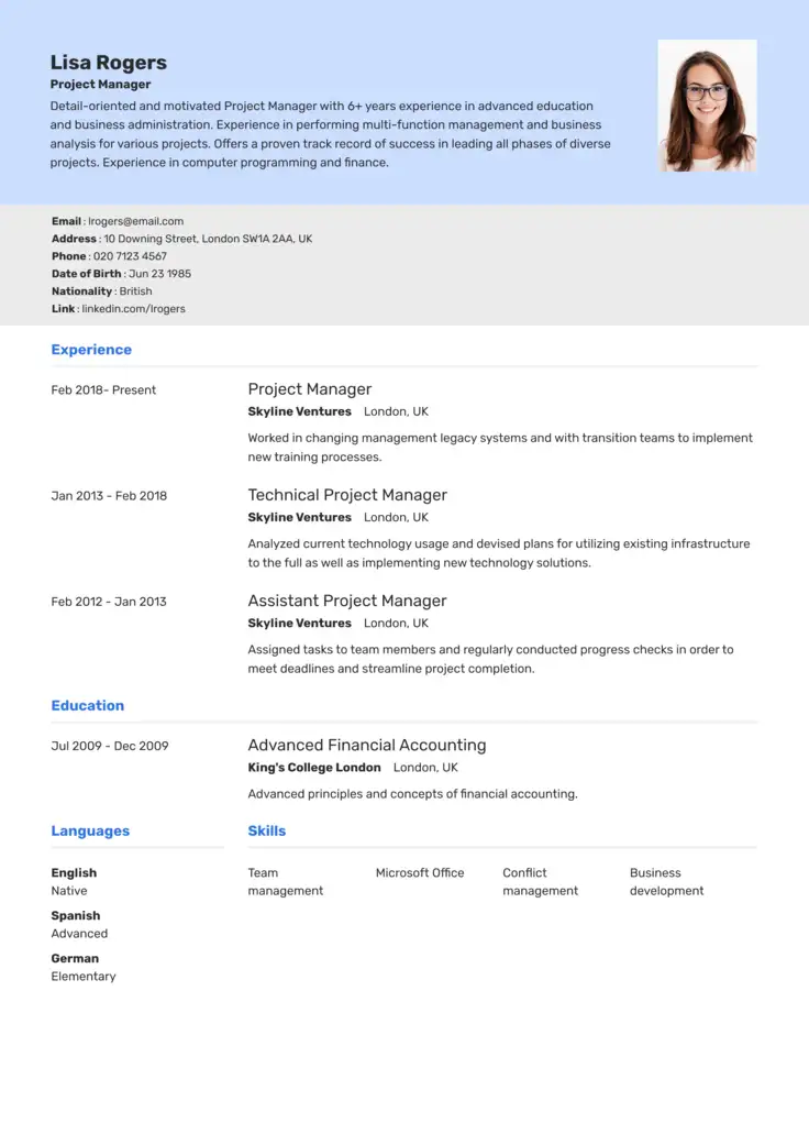
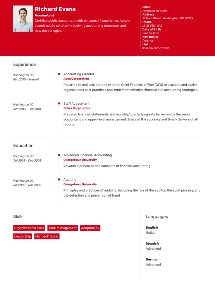
For a quicker setup, use industry-specific resume templates to help guarantee your layout automatically meets these professional design standards.
Everything You Need for Your Job Search
Create a professional resume, improve your LinkedIn profile, and practice for interviews in one place.

Resume Font FAQs
Go over the answers to the following frequently asked questions below to help you choose the perfect font for your resume.
If you like serif and sans-serif fonts, this also will depend entirely on your industry, and picking the right one for your role will help you do a better job of tailoring your resume. Both styles work well, but they send very different messages to recruiters:
- Sans Serif (e.g., Calibri, Arial): This style is useful for tech and startup roles.
- Serif (e.g., Garamond, Georgia): These fonts are ideal for corporate, legal, or academic resumes.
Recruiters generally prefer fonts that are easy to skim. Sans-serif fonts like Calibri, Arial, or Helvetica work well for many types of resumes.
No, Applicant Tracking Systems (ATS) often struggle with custom or decorative fonts. If the system cannot decode the typeface, your resume text will turn into unreadable symbols, meaning it’s better to stick to standard fonts.
While Times New Roman remains highly readable and ATS-friendly, its overexposure makes resumes look generic and uninspired. You can try switching it for Garamond or Georgia for a much more contemporary look.
Geometric sans-serif fonts like Helvetica, Roboto, or Lato are ideal for tech roles. Their clean lines and minimalist aesthetic project innovation and technical precision, aligning perfectly with the modern branding of startups and major technology firms.
If you are a student or an entry-level applicant, you should use open, highly readable fonts like Calibri or Georgia. Choosing a classic serif like Georgia can help fill out sparse layouts naturally, while clean headers paired with distinct bullet points make an entry-level background look incredibly organized.
Struggling with Resume Writing?
Ease the process with our templates
Related Posts