
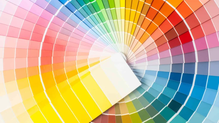
Even though your work history and skills are what will win over a recruiter, the color scheme of your resume is an important part of its design and there is a balance to be struck between creativity and professionalism.
The best colors to use on your resume depend on the position you’re applying for. Choosing a color can seem like something trivial, but it is important when you want to make a good impression.
You can use an AI resume builder with different colored templates to make the job easier, but there are a number of things you should be aware of when choosing the perfect color combination.
That’s why, in this article, we’ll go over the best resume colors for creative and professional roles. Keep reading to find out how to choose the correct style for your resume.
Should You Use Color on Your Resume?
You may not be applying for a marketing role, but colors are often used to sell products and influence consumer behavior. You can apply the same logic of “selling” your resume to an employer.
Adding color to your resume can:
- Make it look stylish and easy on the eye
- Help point out the really important details
- Show a bit of your personality
- Reflect industry standards
- For roles that value creativity, the use of color can showcase your innovative thinking and willingness to take risks.
- Enhance accessibility for readers with visual impairments, provided there is sufficient contrast between text and background.
- Evoke different emotions.
However, you’ll need to choose the right color to ensure that your resume truly benefits from all these advantages without taking away from the content.
Use our handy resume builder to do just that by selecting between a variety of templates that are available in different colors.
What Are the Best Colors for a Resume?
There is no simple answer to this question. The best professional resume colors depend on the profession you’re applying for and the impression you want to give. However, there are some basic principles to keep in mind.
💡 Our expert’s advice

Overuse of color or poor color choices can make a resume look unprofessional or gimmicky, potentially hurting the chances of getting hired.
-
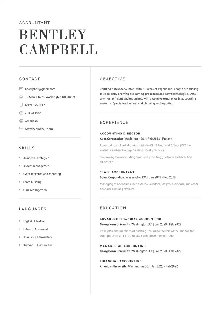
Add your text on this side, you can also replace the image block with icon block.
Different colors can convey different emotions and meanings, and using them strategically in your resume can help you make the right impression. We suggest testing color choices on different devices to ensure they appear as intended.
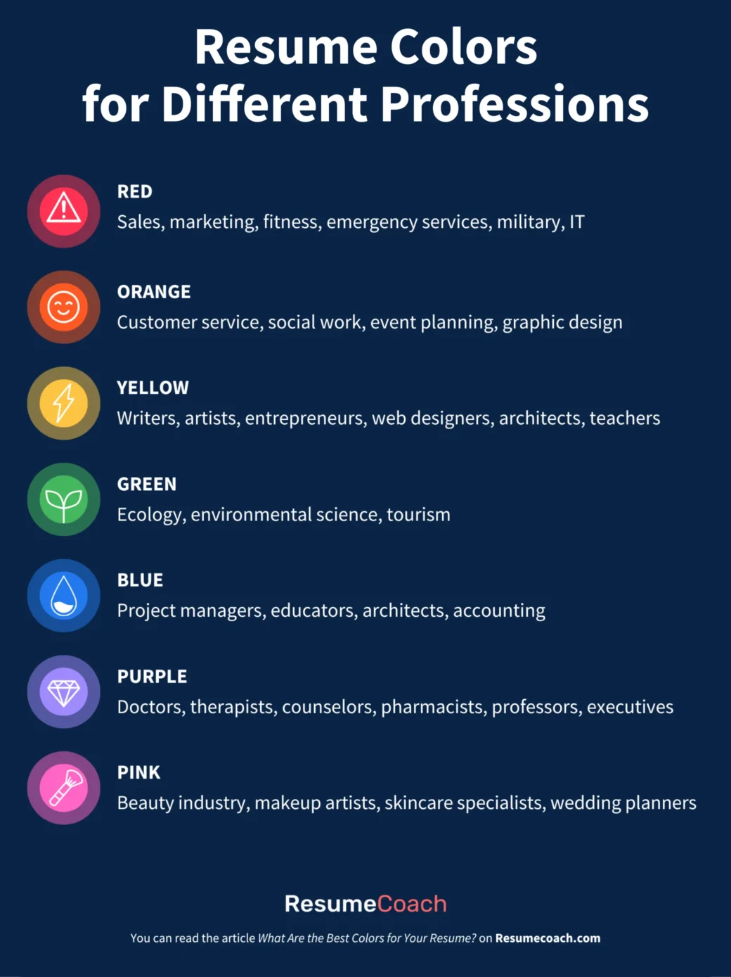
Here’s a breakdown of some common colors and the professions that can benefit from them.
Please note that cultural perceptions of colors can vary significantly across regions and societies. It is advisable to consider cultural sensitivities and norms when tailoring your resume for international or multicultural audiences.
Use color strategically to highlight your personality while still conveying professionalism, depending on your target role and industry.
Best colors for a creative resume
If you’re applying for a creative job then the advice mentioned in the previous sections might not apply.
Your resume needs to show that you’re creative, and it may be necessary to use bright colors or more than one color.
A couple of examples include:
- Purple and gold: A deep purple with gold accents can evoke a sense of luxury and sophistication, making it a suitable choice for high-end or artistic professions.
- Yellow and charcoal gray: A sunny yellow with charcoal gray can create a striking balance between a bright, optimistic color and a neutral, professional shade. This combination works well for creative industries like graphic design or marketing.
You can use a professional resume template aimed at creative professions, which will save you a lot of time from choosing between different colors.
While creativity is essential, ensure that your resume remains easy to read. Use clear fonts and maintain a clean layout to avoid overwhelming the reader.
Your resume should prioritize high-quality content.
If your creative resume is designed in color, make sure that your type, hierarchy of information, and other visual elements still work when printed in black and white.
Don’t use infographics, emojis, or icons that resemble emojis, as ATS may not be able to understand the information you want to convey from them.
💡Tip
It is a good idea to use the same colors in your cover letter and your resume. This helps to create a personal brand.
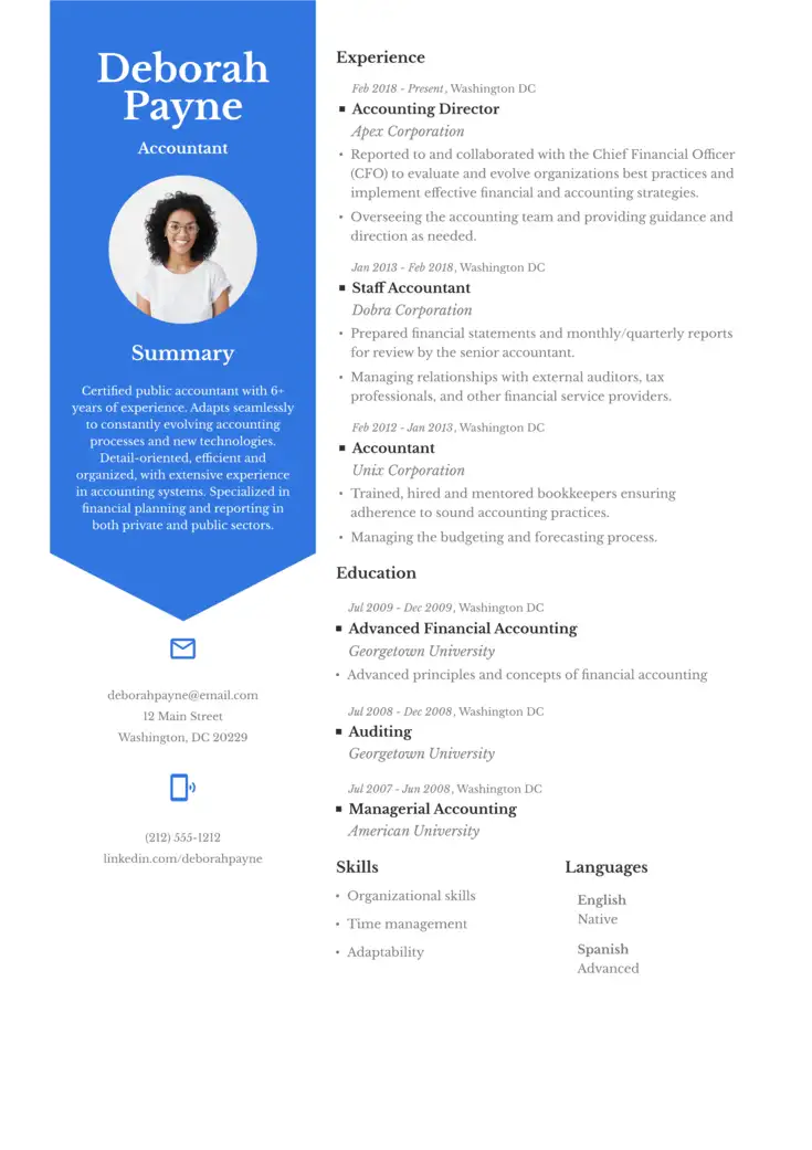
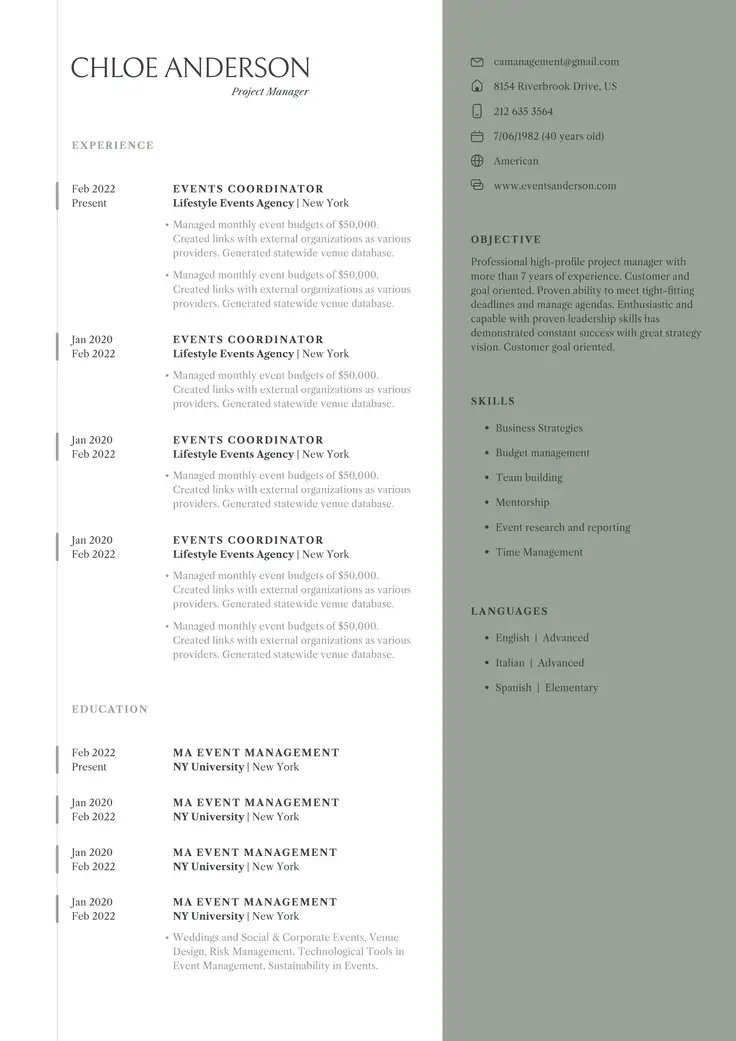
The top professional resume colors
When it comes to resumes in sectors such as finance, accounting, law, or government roles, sticking to classic, clean colors ensures a polished and refined look.
Here are the top picks:
- Navy blue: Trustworthy and dependable, perfect for corporate or management roles.
- Dark gray: Neutral and professional, a good choice for traditional fields like law or finance.
- Black: Timeless and aesthetically pleasing, suitable for nearly any professional field.
- Burgundy: A bold choice, perfect for roles in marketing, public relations, or creative leadership where confidence and sophistication are valued.
- Teal: Fresh and modern, a good fit for industries like tech, startups, or innovation-focused roles.
These colors help you project professionalism while making sure that your resume remains easy to read.
-
💡 Our expert’s advice
Color can affect attention and visual processing. One study on color vision and attention found that people with different types of color vision (trichromats vs dichromats) focused their gaze differently when viewing complex images like paintings. This suggests color choices on a resume could potentially influence where recruiters direct their attention.
Language and cultural factors can also influence color perception. Research has shown that the language we use can actively affect how quickly we perceive different shades of color. This means that color choices may be interpreted differently depending on the recruiter’s cultural and linguistic background.
How To Choose The Right Color For Your Resume
Remember you don’t only want cool colors, you want your resume’s design to send a message. It should also match who you are professionally.
Here are some tips to help you pick the right color:
- Stay professional: Colors are fun, but your resume is serious business. Pick colors that fit the job you want. And skip the super bright or wild ones.
- Mix and match: Remember the color feelings we talked about? Use colors that go well together. If they clash, your resume might look messy.
- Stick to three: Stick to three colors max. It keeps things neat and helps the important stuff pop. Too many colors? It’s confusing.
- Make your brand: Think of your resume as “You: The Brand.” Not sure what colors match the job? Add colors you think match your personality.
- Test it out: Before you send your resume, print it. Try it in color and black and white. Make sure it still looks good and is easy to read.
- Consider industry standards: Research color norms in your target industry. Some sectors are more conservative (e.g., finance, law) and prefer subtle colors, while others (e.g., creative fields) may appreciate bolder choices.
- Be consistent: If you use color in your resume, carry the same color scheme through to your cover letter and other application materials for a cohesive personal brand.
- Consider accessibility: Be mindful of color blindness. Avoid relying solely on color to convey information and ensure there’s enough contrast for those with visual impairments.
- Consider File Format: If submitting digitally, ensure your chosen colors render correctly in different file formats (PDF is usually safest).
Follow these steps, and you’ll have a resume that makes your skills and experience look as good visually as professionally.
Using Colors on Your Resume: Essential Takeaways
After reading our guide, you can tell that adding color isn’t just a skill; it’s an art! To help you remember how to choose the best color for your resume, here’s a quick recap:
- Be clear: Colors are fun, but your words should shine. Make sure everything’s easy to read.
- Make It pop: Use colors to highlight the big stuff. It’ll grab attention.
- Match your job: Pick colors that feel right for your job. It helps you fit in and stand out at the same time.
- Keep it simple: Stick to three colors max. It will help your resume look neat and keep things focused.
- Avoid common mistakes: Too much stuff, odd fonts, or a messy look can be a turn-off. Keep it tidy.
- Helpful tools: Resume tools can do the color work for you. They make things look just right without the fuss.
You can also check out colorful resume examples to give you some inspiration.
In short, a dash of color can make your resume special. Use it wisely, and your resume will stand out from the rest in the best way possible!
FAQ
The most attractive color for a resume depends on the industry and the impression you want to create. Blue is often considered the best choice for its association with trust and professionalism, making it suitable for most industries.
Neutral tones like grey or navy blue are also highly recommended for a polished and professional look. For creative roles, subtle accents of colors like purple or green can help you stand out while maintaining a professional tone. Avoid overly bright or distracting colors.
Lastly, use no more than 2 or 3 colors and ensure they complement each other for a polished, readable design.
Blue is widely considered the most attractive color for a resume because it conveys trust, professionalism, and calmness, making it ideal for a range of industries such as finance, law, and management.
Navy blue, in particular, is a popular choice for conservative fields. For creative roles, colors like teal or coral can also stand out while maintaining professionalism.
Ultimately, the best color depends on the industry and the impression you want to create, but blue remains a safe and versatile option.
Yes, using color on a resume can be a good idea if done thoughtfully. Color helps draw attention to key details and can make your resume stand out, especially in creative industries.
However, it’s important to use color sparingly and strategically—stick to 1 or 2 accent colors that complement your content without overwhelming it.
In more traditional fields like finance or law, subtle tones such as navy blue or gray are safer choices to maintain professionalism while adding a modern touch.
Struggling with Resume Writing?
Ease the process with our templates
Related Posts